“I like my work to look decorative and elegant. I find the softness of the female form incorporates these qualities and [is] more complementary to my work,” he said. “The newest work uses color and shapes, rather gratuitously, as a framing device—a way to move the eye around and to engage the viewer. Like an insect drawn to light, we are drawn to intricacy. Not saying that simplistic works don’t draw us in. However, when something is full of ‘information,’ we are pulled in to examine and define what it is we are looking at. Color helps define the hundreds of shapes I use in a painting and the more color I use, the easier it is to define.”
Jones’ equal treatment of the abstract and the figurative in his work stems from his two of his greatest loves: high fashion and contemporary non-representational painting. Though commonly thought to be unrelated (consumer-oriented fashion design and lofty, conceptual abstract art seem far apart on the traditional low brow-high brow art spectrum), Jones sees a compatibility in these forms of expression despite their superficial differences.
“A few years back I fell in love with contemporary nonrepresentational painting and thought, ‘I wish they would throw a figure in there, I’d love it even more.’ So I did,” Jones traced the genesis of his aesthetic direction. “Although, it’s funny, I feel like I’m starting to lose the need to have a figure in the painting. I’m wanting to go more and more abstract with it. Look for that in years to come, I’m sure.”
The figure’s place in abstract art clicked into place when Jones examined the intricate designs in runway fashion. Lavish and baroque, unwearable yet captivating, the haute couture collections of the top fashion houses echo the compositional qualities he found appealing in abstract art. Exquisite arrangements of color and texture are adapted to frame the contours of the human figure; the garments elevate the body to become something otherworldly and extraordinary.
“The designer whose work inspired me to look at fashion in a different way is the late Alexander McQueen. Each one of his conceptual pieces is an elegant sculpture. I have a few of his books, but, to be honest, you have to see his collections in motion. Watching the models interact with the pieces is extremely captivating. The models aren’t secondary: they become a part of the art. I want that balance in my work. I don’t want you to see a portrait of someone or just be consumed with abstract clutter, but rather see a harmonious motionless dance of shapes decorating the figure. Where both elements—representational and non-representational—become one.”
The union of abstraction and figuration in Jones’ work is an extensive process carried out through a variety of media. He loathes keeping a sketchbook—something he jokingly refers to as a “glorified, bound to-do list”—and draws on loose-leaf paper, playing with ideas for elaborate headdresses and floral arrangements. A model is selected and a photo shoot is arranged. Jones spends hours perusing the photos, selecting individual positions of the hands, neck, torso and face and then “Frankensteining” these features on Photoshop to create the basis for his figures.
“I’m extremely methodical when it comes to most of my paintings. Especially in the beginning stages. I have come up with a loose formula I like to start with when I’m in the early stages of creating a new piece: 30 percent structure, 70 percent chaos. This formula sufficiently fulfills my need to ‘illustrate’ representational objects,” Jones said when asked about his preliminary process. “Take a look at one of the pieces that has shapes scattered all around the composition. Every single straight edge and mechanical shape is pre-planned, down to the size and color. However, all the organic round shapes and splatters are produced more sporadically.”
My work is a constant experiment, a balancing act of chaos and structure, explored through a variety of traditional media.”
After the figure is created digitally, Jones sketches it out on paper. Then, the initial sketch is scanned and further manipulated on Photoshop as the artist carefully arranges the geometric shapes and abstract elements. This digital composition is projected and traced. The rest of the process is executed entirely in traditional media. First, Jones begins by filling in translucent colors with watercolor or ink. Then, layers of Prismacolor pencils, water-soluble wax pastels (“The blending capabilities are almost endless, blending with my fingers and a blending stump, each revealing unique results.”) and water-soluble oil paint are layered onto the figure. The surrounding abstract elements are then rendered in acrylics.
We often turn to works for art for meaning, as if the artist is supposed to transmit an esoteric wisdom, an ideology that the viewer must decode from the images. And while Erik Jones doesn’t subscribe to this view of a painter as a shaman or philosopher, his visual experiments themselves behold another form of ingenuity that becomes apparent throughout his body of work: “I don’t purposefully dive into any certain conceptual endeavors when starting a painting. And I don’t necessarily have an opinion I’d like to articulate through painting. My work is a constant experiment, a balancing act of chaos and structure, explored through a variety of traditional media. Maybe that in itself is some sort of concept?”*
This article was originally published as the cover feature in Hi-Fructose Issue 27, whcih is sold out. Like what we do? Subscribe today and get our latest print issue as part of your subscription here.

 Italian artist Marco Grassi applies his hyperrealist painting chops to portraits that are slightly unconventional. While he paints mostly young, beautiful female subjects in traditional studio settings, his work becomes remarkable for the surreal accoutrements with which he adorns his characters. In one piece, a model's back becomes porous with a carved, baroque design — her body hollow like a doll's. In other paintings, he experiments with colorful body paint, tattoos, fabrics, and even a translucent, shield-like piece of futuristic jewelry. Throughout his portrait series, Grassi uses his skills with oils to create convincing illusions that make it easy for viewers to suspend disbelief.
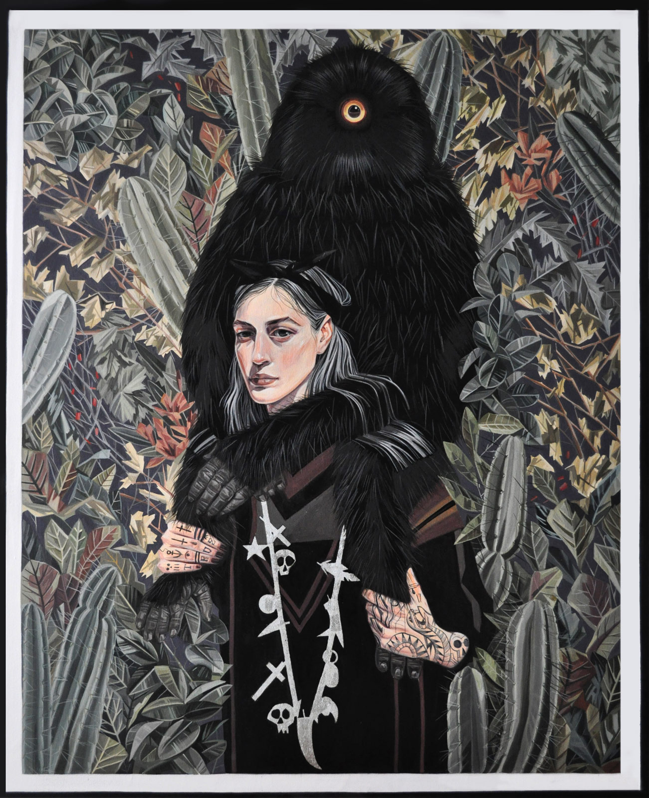 Mariajosé Gallardo’s stirring oil paintings carry both centuries-old influences and qualities of contemporary illustration. The Spanish artist often pairs modern characters with creatures both of and beyond this world. And as a statement suggests, her lush backgrounds have deep roots in art history.
 English painter Mary Jane Ansell creates work that both subverts gender roles and pays homage to the history of portraiture. In a new show at Corey Helford Gallery in Los Angeles, “Of Dreams, Birds and Bones,” she offers a series of paintings that evolves these ideas. The show kicks of June 10 and lasts through July 8. Ansell was last featured on cctvta.com here.
 Beijing-based painter and illustrator Alice Lin creates nostalgic, whimsical works on paper. The world she develops evokes Victorian-era storybook illustrations with its lush, ornate flora as a recurring decorative motif, but the artist's imagery is far more contemplative and melancholic. Using watercolor and natural mineral pigment, she envelopes her characters in a marbled texture with wisps of gradients that seem to float though her scenes like fog. As viewers, we come upon her characters in moments of contemplation, staring with downcast eyes or obscuring their faces from our gaze.